EARNED VALUE AND WHATNOT ... plus this:
Your company has a common resource pool across all its projects. Only POD Administrators may modify the resource pool. This ensures that the resource pool remains coherent. All POD users are automatically present in the resource pool. You can add non-user resources and modify the properties of any resource by opening up the Master Project (Resource Pool) in the planner. POD Administrators will get this option at startup of the Planner.
A common concern is to make sure your resources are available. Both the Histogram and the Resource Gantt Chart can be used to see resource usage across all projects.
THIS MIGHT BE BETTER UNDER A "RESOURCE TRACKING" CATEGORY
Shows the available resources.
Cumulative
Histogram
Work vs. Cost ... if Work, then list of attributes and if Cost, then different list of attributes
Resource Filter -- No Filter, Material Resources, Work Resources, In Progress Assignments, Unstarted Assignments, Work Complete
There's a calendar here too.
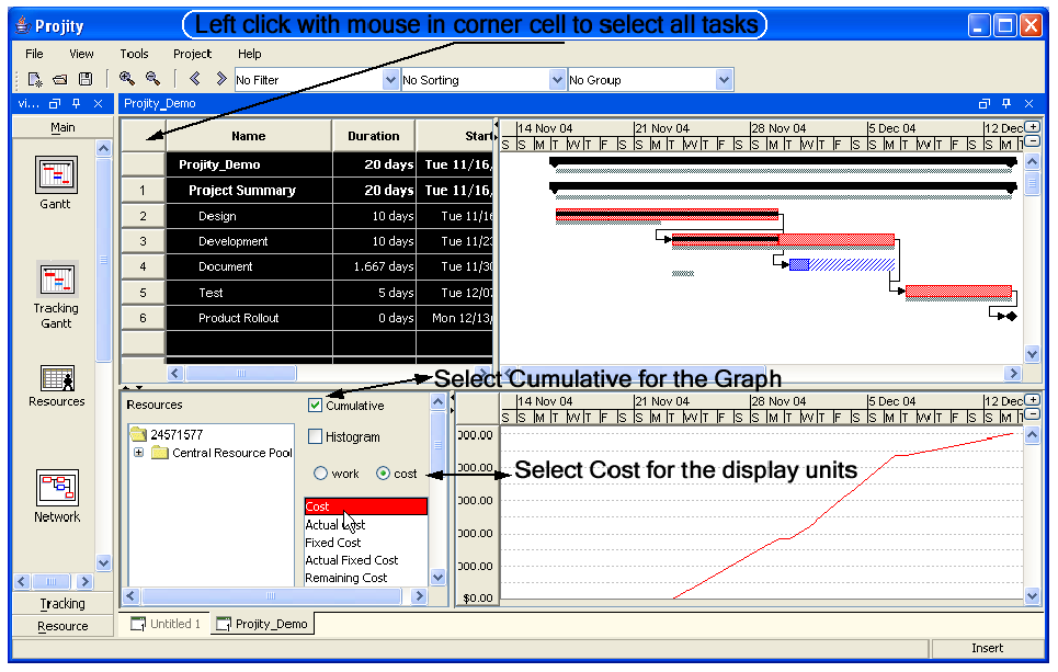
The Charts screen looks very similar to the Histogram based on the default settings. There are still the quadrants with the top two representing the standard Gantt chart. You can still select the Tasks that you would like represented in the chart below. However the bottom quadrants function differently. You can see that the bottom right quadrant defaults to showing a histogram view. You display this based on Work or Cost units. The chart defaults to a Histogram view but you can also show a line graph that is Cumulative. This is once again a great analytic tool for ascertaining the cost or work profile as you progress in the Project.
- Lets click on the Cumulative to select this option
- Click on the Histogram to 'de-select' this option
- Click on the Cost instead of Work
- Make sure all the tasks are selected on the Gantt (if not once again click on the top cell, above the 1 and to the left of the Name)
Your Screen should look as below
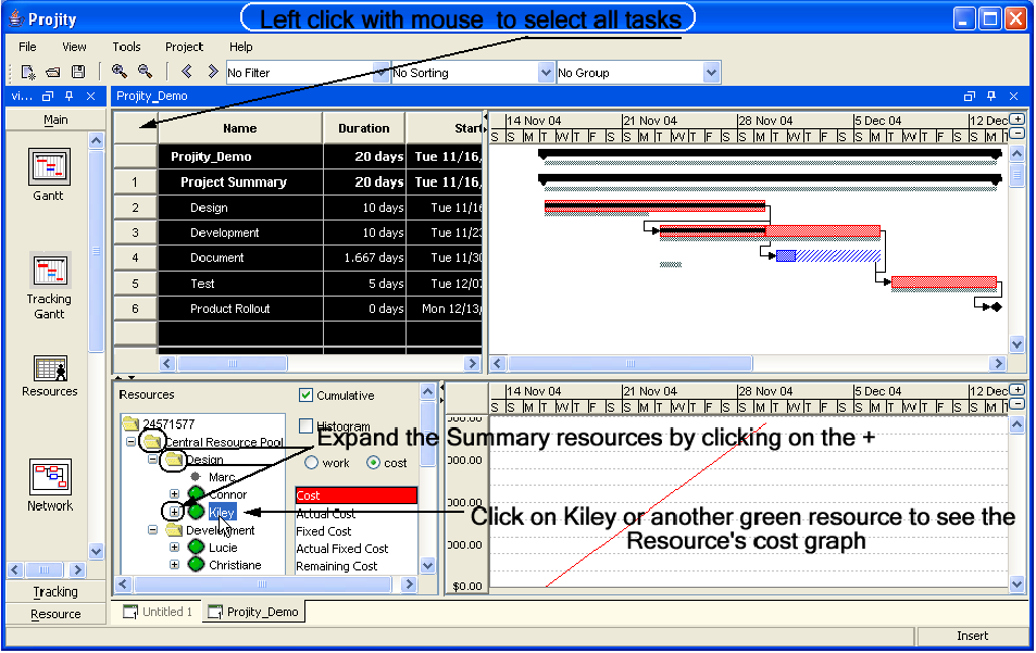
- Click on the + next to the Resource Pool
- Click on the + next to Design, the + next to Development and the + next to Marketing
- You should now see both the Summary Resources and the Resources themselves
- Note the Green indicates the Resource has been assigned to this Project or set of selected Tasks (Marc who is not assigned does not have a Green icon next to his name)
- Click on each Resource with a Green icon next to it
- You will see the Cumulative, Cost profile for each
We can also Graphically compare many Earned Value metrics. You can see that in the Chart the Cost Value is highlighted in Red. On the Chart itself you can see that there is a Label under the graph to also indicate the Red Line is a cost value. When the Cost radio button is selected you can select any/all of the following to be also graphed for comparison. You can select multiple items to be graphed by simply depressing the CTRL key on your keyboard and selecting which items you wish to have included in the graph.
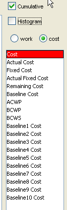
Actual Cost = The cost reported as expended for a task or project
Remaining Cost = The estimate of cost left to be incurred until the task or project is complete
Baseline Cost = The cost associated with the 'snapshot' taken of your project at a particular time. There can be up to 11 baselines in Project-ON-Demand and these can all have separate cost estimates.
Baseline1-10 Cost = This is similar to the Baseline Cost, but is a different version of the Baseline. This can be used for capturing many schedules such as a Resource leveled schedule and corresponding costs.
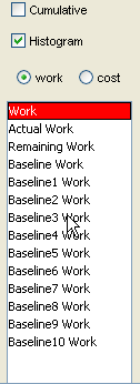
If you select the Work radio button the graph options change to the following:
If you are still with the Tutorial Project then follow the steps below. The Earned Value calculations require that you have a baseline and progress to have data to calculate. If you are creating a project then ensure you have:
- Baselined the Project
- Update percent complete (progress) on some tasks, select them as you like
- Extend the duration of a few tasks to Insure the baseline and plan are not identical (will then have a variance from plan)
- Delay a task, once again ensuring the baseline and current plan are not identical
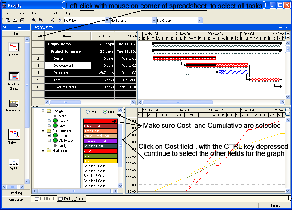
In the Gantt chart select all tasks
- In the Chart click on the Central Resource Pool
- Depress the Shift key on your keyboard
- Click on the Computer Resource
- All Resources should be selected
- Insure that Cost and Cumulative are selected
- Click on the Cost, depress the Ctrl key on your keyboard
- Click on the Actual, Remaining, Baseline Cost, ACWP, BCWP and BCWS
Your Screen should look like the following
This will then display an Earned Value graph that will graphically display your project earned value.
We will discuss the details of Earned Value below. However it is good to see the Costing graphs that Projity can analyze.
In the Gantt Chart view:
- Click on View in the menu bar
- Select Charts
- Select all tasks by placing your cursor over the corner cell on the spreadsheet and left clicking on your mouse
You can see that the Histogram has changed to a line graph which is now cumulative. We still have all the tasks selected in the project and also are still using the Summarized Central Resource Pool. Thus we are seeing a cost profile of all tasks and resources in the Project.
We can look at the Cost or Work of individual resources or groups of resources very easily within Projity.
Note: If the plan and baseline are identical you will not see differences in the Graph bars. This is great when you are running your projects, just not for our tutorial.