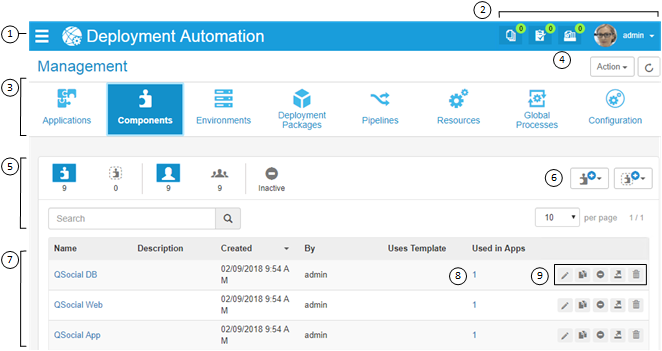
The Deployment Automation user interface enables you to create and configure the Deployment Automation elements and initiate the deployment of your component versions. You can see and access only the elements for which you are authorized. Some common elements of the user interface are indicated in the following figure.

- Click the slide-out menu icon to open the navigation menu, then
expand and select the context you want to work in. Depending on your role and
privileges, you'll see some or all of the following selections:
- Most Recent: Records the pages you have recently visited so that you can quickly navigate between elements you are configuring
- Management: Where you create and configure the primary elements of Deployment Automation, design your processes, and run deployments
- Administration: Where you configure selections that will be available to users when they work with Deployment Automation
- Deployment: Where you view information about deployments on a Timeline, run deployments, and schedule deployments and blackouts
When the navigation menu is expanded, click the pin icon at the top right of the menu to pin it so that it stays open. Click the pin again to make the menu automatically collapse.
- The dashboard is shown at the top of the page. Options here include
the following:
- Version Import Queue: View active version import requests
- Pending Approval Requests: View requests awaiting approval
- Processes: View processes executed within a given range of time
- User Profile menu: Select from options to configure preferences such as locale, get help, visit the user community, view information about the product version, and sign out
In the dashboard you may also see a message indicator
 . Click this to see
important messages, such as upgrade suggestions for your server and agent
versions.
 - Select from the navigation menu to view and manage information. This example shows Components selected.
- Select from the Action menu for actions specific to the current context, such as Management, Administration, or Deployment pages or a selected application's page.
- To filter the information shown in the content area, click the filter buttons to select or toggle filter criteria. The filter Search box searches various columns and further filters the list by showing only items that match the search string. In this example, the list is filtered by components that belong to the current user, and inactive components are not being shown.
- Select from actions to create or import an instance of the selected
element. For example, in the
Component page, click the
Component Actions button (
 ) and then
select
Create Component to create a component.
- This section is the content area of the page. In this example, the list of components is shown. Click the up or down arrow beside a column name to sort ascending or descending by that column.
- Click any links in the content area to see more information. For example, for components, click the number under Used in Apps to see the names of the applications the component is associated with.
- Select from actions available for listed items. For example, in the
component list, click the delete icon (
 ), to delete a component.