Responsive forms, available only for modern forms, enable the layout to adjust to the screen size by wrapping rows to new lines as needed. For smaller screen sizes like tablets and mobile phones, responsive forms eliminate the need to scroll horizontally to view the contents of the form. All scrolling is vertical.
Rather than the auto/percent/fixed width used by standard forms, responsive rows split their total width into 12 implicit blocks, and distribute those blocks between their cells. These block sizes correspond to percentages of the total width.
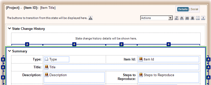
A typical layout contains two field columns with widths of 2 - 4 - 2 - 4 blocks, as shown below:
Previewing Responsive Forms
When you preview a responsive form, you can resize the form to test how it will appear in different screen sizes. Below you can see how the rows wrap as the screen width decreases:
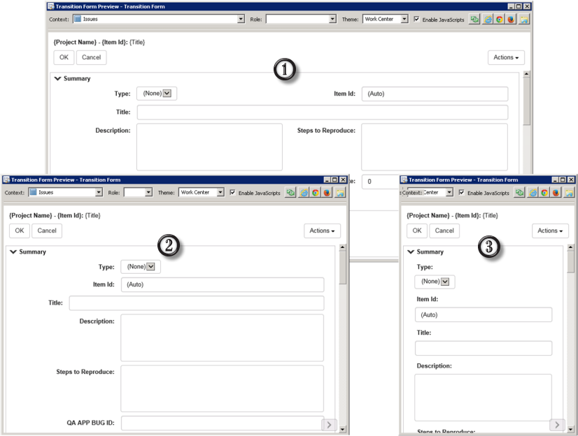
- On screens that are 1024 pixels wide or greater, responsive cells will appear as shown in SBM Composer.
- Between 720-1023 pixels wide, responsive cells will double in width, causing each row to split down the middle and wrap into a second row.
- Below 720 pixels, all cells render as their own row for maximum horizontal space. All labels and fields are forced to left align for readability.
Responsive Forms and Double Cells
Responsive forms use double cells to combine the label and the field into a single element so they don’t separate as cells move around at different sizes. This is simple enough for left-placed labels, but when using top-placed labels, the entire pair of rows must be combined due to HTML layout limitations. Elements other than field/label pairs will be similarly tied together and can wrap together unexpectedly.
To make sure the double cells are working as expected, preview your responsive forms and turn on the Toggle responsive cell borders option. When you hover over any double cells, a solid blue border extends across both linked cells, while its component controls have dashed borders.
The example below shows a horizontal double cell with a left-placed label.
The next example shows vertical double cells with top-placed labels. As you can see, there is extra content in one of the rows that is not a field/label pair. This is flagged in the Preview Tools window.
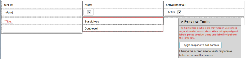
Therefore, when using top-placed labels, use only label/field pairs in the same row. This will prevent the creation of vertical double cells that contain anything other than the label/field pairs.
Notes on Working With Responsive Forms
-
A form can include a mix of responsive and standard containers. On the General tab of the Property Editor, you can choose a responsive or standard layout for the selected container, or choose to use the form's layout.
-
You can specify only AutoSize or Fixed for responsive row types. Fixed is applied as the minimum row height.
-
Responsive tab controls will be converted to "pills," so that tabs with long names or many tabs can wrap more freely on smaller screens.
-
You cannot place controls as new columns in responsive-layout containers. To add a new column manually, right-click and select Add Column, or press Ctrl+Shift+left/right arrow keys. These will be constrained to a maximum of 12 columns.