Overview
The My Work List widget is configured from the Module Designer. Select a module (or add a new one), then add a tab into which a My Work list can be added.
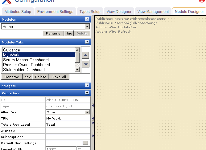
Properties for the widget can be set on the left-side under Properties.
When the burndown appears in a tab in Agile On Demand, you must first select the correct interval (product, release, team, or sprint). In this case, the burndown chart was configured for a release. Once a release is selected, the burndown chart will be available.
Add My Work widget
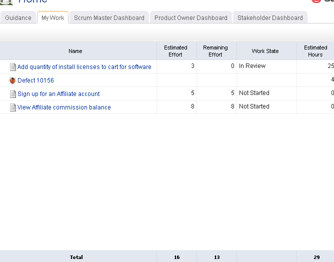
You can add a My Work list to any custom view or custom workflow that your organization wants to add to Agile On Demand. A My Work list must be configured for .
- From the application toolbar, click Setup and select Configuration.
- In the Configuration module, select Module Designer.
- Under Modules, select an existing module or click New to add a module. (If you click New, enter the name at the prompt and click OK.)
- Under Module-Tabs, click New to add a new tab. At the prompt, enter the name of the view, and then click OK.
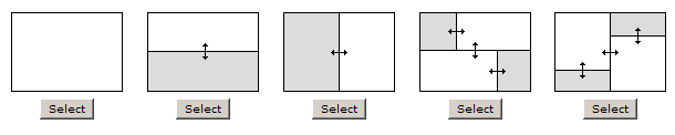
- Select the layout type. The most commonly used layout types are single, over-under, and side-by-side. (The fixed-size and fixed-position layout type does not support the Agile On Demand widgets.)
- Select the My Work List widget, click (and hold down) the mouse button, drag it to the layout pane on which you want it added, and then release the mouse button.
- Set the properties.
- Click Save All.
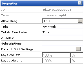
Properties
The My Work List widget has the following properties:
| Properties | Description |
|---|---|
| Allow Drag | The Allow Drag property is used to indicate whether users can move a widget around on a page while they are using it. |
| AppendUsernameToQSA | The AppendUsernameToQSA property is used to xxxxx. |
| Background-Color | The Background-Color property is used to set the background color of an attribute, control, or widget. |
| BrandXML | The BrandXML property is used to control the visual display and color scheme of a chart. |
| Color | The Color property is used to set the font color of an attribute, control, or widget. |
| Configuration | The Configuration property is used to xxxxx. |
| ConfigureXML | The ConfigureXML property is used to control the data displayed on the single object chart. |
| DataProcessor | The DataProcessor property is used to xxxxx. |
| DataProcessorAssembly | The DataProcessorAssembly property is used to xxxxx. |
| DefaultURL | The DefaultURL property is used to xxxxx. |
| Events | The Events property is used to add JavaScript to a page. For the Button and Image elements, click the button associated with the Events property to display the Code Editor dialog. In the Code Editor dialog, you can write code to be executed in association with the element (for example, code that executes when the user clicks a button). |
| Font-Family | The Font-Family property is used to set the font, such as verdana, courier, or arial. |
| Font-Size | The Font-Size property is used to set the size of a font. |
| Font-Style | The Font-Style property is used to set the displayed style of the text: normal, italic, or oblique. |
| Font-Weight | The Font-Weight property is used to set the displayed weight of the text: normal, bold, or bolder. |
| FrameBorder | The FrameBorder property is used to xxxxx. |
| Height | The Height property is used to specify the height (in pixels) of an attribute, control, or widget. |
| Hyperlink | The Hyperlink property is used to xxxxx. |
| Left | The Left property is used to set the number of pixels from the left side of a page that an attribute, control, or widget is positioned. Use this property to align the attributes, controls, and widgets on a page. |
| Legend | The Legend property is used to xxxxx. |
| ID | Read only. The ID property is used to show the unique ID of the design control. |
| Src | The Src property is used to xxxxx. |
| TabIndex | The TabIndex property is used to set the navigation order when using the TAB key. When the user tabs through the page, the field with a Tab Index of "1" will be first field, "2" second, and so on. For a read-only field, you should not add a Tab Index. This lets the user skip over this field when tabbing through the page. |
| Text-Align | The Text-Align property is used to xxxxx. |
| Text-Decoration | The Text-Decoration property is used to xxxxx. |
| ToolTip | The ToolTip property is used to add customized tool tips for the control or attribute and over rides the default tool tip. |
| Top | The Top property is used to set the number of pixels from the top of a page that an attribute, control, or widget is positioned. Use this property to align the attributes, controls, and widgets on a page. |
| Type | Read only. The Type property is used to show the control type. For example, linklabel, button, hr, and so on. |
| Width | The Width property is used to specify the width (in pixels) of an attribute, control, or widget. |
| Z-Index | The Z-Index property is used to set the order by which attributes, controls, and widgets are layered on a page. For example, you can layer a form on top of an image. |