Overview
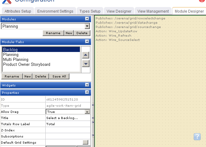
The List widget is configured from the Module Designer. Select a module (or add a new one), then add a tab into which a card wall can be added.

Properties for the widget can be set on the left-side under Properties.
Setting Up Agile Planner → Configuration → Module Designer → Agile Widgets → List
A List is used to add a work item grid to a page in the application.
The List widget is configured from the Module Designer. Select a module (or add a new one), then add a tab into which a card wall can be added.

Properties for the widget can be set on the left-side under Properties.
You can add a backlog to any custom view or custom workflow that your organization wants to add to Serena Agile Planner.


When you add the List widget to a layout pane, you can use the Widget Wireup to synchronize the List widget with another widget, such as a Burndown Chart.
The List widget can perform the following actions:
| Action | Description |
|---|---|
| Wire_Refresh | The Wire_Refresh action allows a Widget Wireup to refresh the information that is available in a backlog or a list. When information changes on the widget that has been configured as the publisher (using the datachange event), updates are then pushed to the widget that has been configured as the subscriber. |
| Wire_SourceSelect | The Wire_SourceSelect action allows a Widget Wireup to load information in a backlog, a burndown chart, or a list that is determined by the selected interval. When the selected interval on the widget that has been configured as the publisher changes (using the sourcechange event), updates are then pushed to the widget that has been configured as the subscriber. |
| Wire_UpdateRow | The Wire_UpdateRow action allows a Widget Wireup to refresh the details of a single row in a backlog or list. When the details of a work item are updated on the widget that has been configured as the publisher (using the onsave event), updates are then pushed to the widget that has been configured as the subscriber. |
The List widget can perform the following publish options:
| Publish Option | Description |
|---|---|
| /serena/grid/datachange | The datachange event allows a Widget Wireup to listen for changes to any work item in a backlog. When changes are detected on the widget that has been configured as the publisher, updates are then pushed to the widget that has been configured as the subscriber (using the Wire_Refresh action). |
| /serena/grid/rowselectchange | The rowselectchange event allows a Widget Wireup to listen for when changes have been made to a specific row in a backlog. When changes are detected on the widget that has been configured as the publisher, updates are then pushed to the widget that has been configured as the subscriber (using the Wire_Refresh action). |
| /serena/grid/sourcechange | The sourcechange event allows a Widget Wireup to listen for when a specific interval is selected for viewing in a backlog, storyboard, or burndown chart. When the selected interval changes on widget that has been configured as the publisher, the information on the widget that is configured as the subscriber is updated to match the information for the new interval (using the Wire_SourceSelect action). |
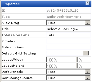
The List widget has the following properties:
| Properties | Description |
|---|---|
| Allow Drag | The Allow Drag property is used to indicate whether users can move a widget around on a page while they are using it. |
| CanChangeSource | The CanChangeSource property is used to indicate whether a user can change the source while they are working on the page. Set this property to No to prevent users from changing the source while working on the page. |
| Default Grid Settings | The DefaultGridSettings property is used to specify whether the designer grid should be displayed, and whether widgets should snap to the grid. |
| Default Mode | The DefaultMode property is used to specify which layout option will be shown to the user by default. The available layout options are list, table, and tree. |
| ID | The work type: portfolio, product, release, team, or sprint. |
| LayoutHeight | The LayoutHeight property is used to specify the height of a control or widget. LayoutHeight can be specified in pixels or as a percentage of the height of the containing pane. |
| LayoutWidth | The Layout Width property is used to specify the width of a control or widget. LayoutWidth can be specified in pixels or as a percentage of the width of the containing pane. |
| Subscriptions | The Subscriptions property is used to list events for which a widget is subscribed. |
| Title | The Title property is used to specify a title that is visible to team members while using the widget or control. |
| Totals Row Label | The Totals Row Label property is used to specify the label for a totals row. |
| Type | Read only. The Type property is used to show the control type. For example, linklabel, button, hr, and so on. |
| Z-Index | The Z-Index property is used to set the order by which attributes, controls, and widgets are layered on a page. For example, you can layer a form on top of an image. |