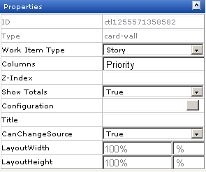
Card Wall

A Card Wall is used to add a card wall (also known as a storyboard) to a page in the application.

Overview

The Card Wall widget is configured from the Module Designer. Select a module (or add a new one), then add a tab into which a card wall can be added.

Configuring a card wall from the Module Designer

Properties for the widget can be set on the left-side under Properties.

When the card wall appears in a tab in Serena Agile Planner, you must first select an interval (project, release, sprint or team).

Adding the Card Wall widget to a view

You can add a card wall to any custom view or custom workflow that your organization wants to add to Serena Agile Planner. A card wall must be configured for a specific interval (project, release, sprint or team).

To add the Card Wall widget to a view
  1. From the application toolbar, click Setup and select Configuration.
  2. In the Configuration module, select Module Designer.
  3. Under Modules, select an existing module or click New to add a module. (If you click New, enter the name at the prompt and click OK.)
  4. Under Module-Tabs, click New to add a new tab. At the prompt, enter the name of the view, and then click OK.
  5. Select the layout type. The most commonly used layout types are single, over-under, and side-by-side. (The fixed-size and fixed-position layout types do not support the Serena Agile Planner widgets.)

    Module Designer layout options.

  6. Select the Card Wall widget, click (and hold down) the mouse button, drag it to the layout pane on which you want it added, and then release the mouse button.
  7. Set the properties.

    Properties for the Card Wall widget.

  8. Click Save All.

Wireup Options

When you add the Card Wall widget to a layout pane, you can use the Widget Wireup to synchronize the Card Wall with another widget, such as List or Burndown Chart.

The Card Wall widget can perform the following actions:

Action Description
Wire_SourceSelect

The Wire_SourceSelect action allows a Widget Wireup to load information in a backlog, a burndown chart, or a list that is determined by the selected interval. When the selected interval on the widget that has been configured as the publisher changes (using the sourcechange event), updates are then pushed to the widget that has been configured as the subscriber.

The Card Wall widget can perform the following publish options:

Publish Option Description
/serena/grid/sourcechange

The sourcechange event allows a Widget Wireup to listen for when a specific interval is selected for viewing in a backlog, storyboard, or burndown chart. When the selected interval changes on widget that has been configured as the publisher, the information on the widget that is configured as the subscriber is updated to match the information for the new interval (using the Wire_SourceSelect action).

Properties

The Card Wall widget has the following properties:

Properties Description
CanChangeSource

The CanChangeSource property is used to indicate whether a user can change the source while they are working on the page. Set this property to No to prevent users from changing the source while working on the page.
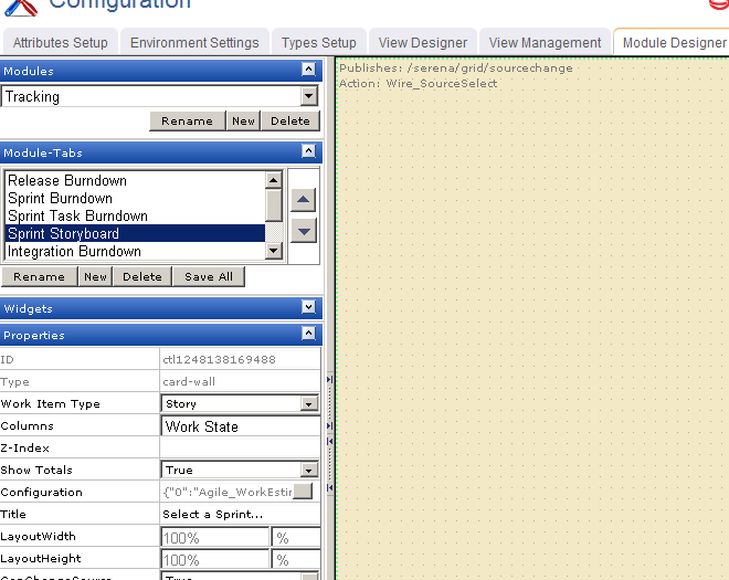
Columns

The Columns property is used to specify the item types to be shown in the columns of a Card Wall widget.

Configuration

The Configuration property is used to specify the attributes shown on a Card Wall widget.

ID The work type: portfolio, product, release, team, or sprint.
LayoutHeight

The LayoutHeight property is used to specify the height of a control or widget. LayoutHeight can be specified in pixels or as a percentage of the height of the containing pane.

LayoutWidth

The Layout Width property is used to specify the width of a control or widget. LayoutWidth can be specified in pixels or as a percentage of the width of the containing pane.

Title

The Title property is used to specify a title that is visible to team members while using the widget or control.

Type

Read only. The Type property is used to show the control type. For example, linklabel, button, hr, and so on.

Work Item Type

The Work Item Type property is used to set the work item type that is used by this widget or control by default.

Z-Index

The Z-Index property is used to set the order by which attributes, controls, and widgets are layered on a page. For example, you can layer a form on top of an image.