Adding the Custom Help Link widget to a view
You can add a custom help link to any custom view or custom workflow that your organization wants to add to Serena Agile. A custom help link must be configured to point to a URL that is accessible by a user, either a fully-qualified URL for a page that is on the Internet or an internal URL for a page that is within your organization's intranet.
- From the application toolbar, click Setup and select Configuration.
- In the Configuration module, select Module Designer.
- Under Modules, select an existing module.
- Under Module-Tabs, select an existing view (or one that you are currently creating).
- Select the Custom Help Link widget, click (and hold down) the mouse button, drag it to the layout pane (anywhere–only a single Custom Help Link widget will work for any custom view), and then release the mouse button.
- Set the properties.
- Click Save All.
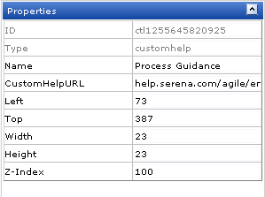
Properties
The Custom Help Link widget has the following properties:
| Properties | Description |
|---|---|
| CustomHelpURL | The CustomHelpURL property is used to specify the URL for a custom help page to be displayed when the help link on a page is clicked. |
| Height | The Height property is used to specify the height (in pixels) of an attribute, control, or widget. |
| ID | The work type: portfolio, product, release, team, or sprint. |
| Left | The Left property is used to set the number of pixels from the left side of a page that an attribute, control, or widget is positioned. Use this property to align the attributes, controls, and widgets on a page. |
| Name | The Name property is used to specify the name of a control or widget. |
| Top | The Top property is used to set the number of pixels from the top of a page that an attribute, control, or widget is positioned. Use this property to align the attributes, controls, and widgets on a page. |
| Type | Read only. The Type property is used to show the control type. For example, linklabel, button, hr, and so on. |
| Width | The Width property is used to specify the width (in pixels) of an attribute, control, or widget. |
| Z-Index | The Z-Index property is used to set the order by which attributes, controls, and widgets are layered on a page. For example, you can layer a form on top of an image. |